CLIENT:
Live!
TIMELINE:
3 Months
ROLE:
UX Designer, Researcher
TEAM:
1 Lead, 1 UX Designer, 1 Visual Designer
Live! is a collection of branded entertainment districts developed by The Cordish Companies, known for setting a new standard in design and customer experience. With high-profile destinations like Texas Live!, Xfinity Live!, and Kansas City Live!, the brand has become synonymous with dynamic sports, dining, and entertainment experiences. Over time, Live! has expanded into casinos and hotels—continuing to deliver its signature blend of energy, hospitality, and best-in-class amenities.
The Problem
The existing digital experience lacked the energy and polish that defines Live! Districts. Navigation was clunky, engagement dropped off quickly, and brand consistency was lost across locations — creating a fragmented and forgettable user experience
Goals
- Unify and increase awareness in brand and design standards across all 12 district sites
- Build a flexible component system that are reusable for future growth
- Stakeholders needs are met
- Generate ticket sales, and decrease user drop off
With the redesign the agency estimated
95%
Increased ticket leads
67%
Faster backend updates with the new design system
30%
Decreased user drop off
RESEARCH & DISCOVERY
Evaluating the existing site
To establish a baseline and align stakeholders on current issues, I conducted a heuristic evaluation across all 12 District sites. This revealed key usability flaws, including confusing navigation, weak content hierarchy, and inconsistent branding. These findings provided clarity on where improvements were needed and helped define a strategic direction for enhancing the user experience.
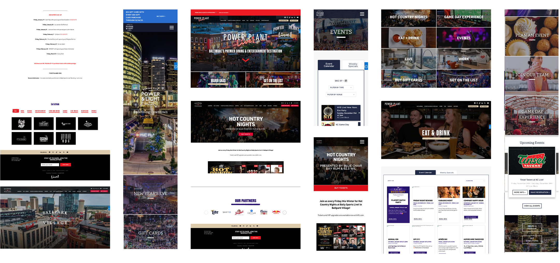
COLLECTION OF PHOTOS FROM THE OLD WEBSITE
Inconsistent Navigation
The sites’ navigation makes finding desired content challenging
BALLPARK VILLAGE
POWER PLANT LIVE!
Inconsistent Design
There are many different card styles throughout and within the sites that respond differently and require different interaction.
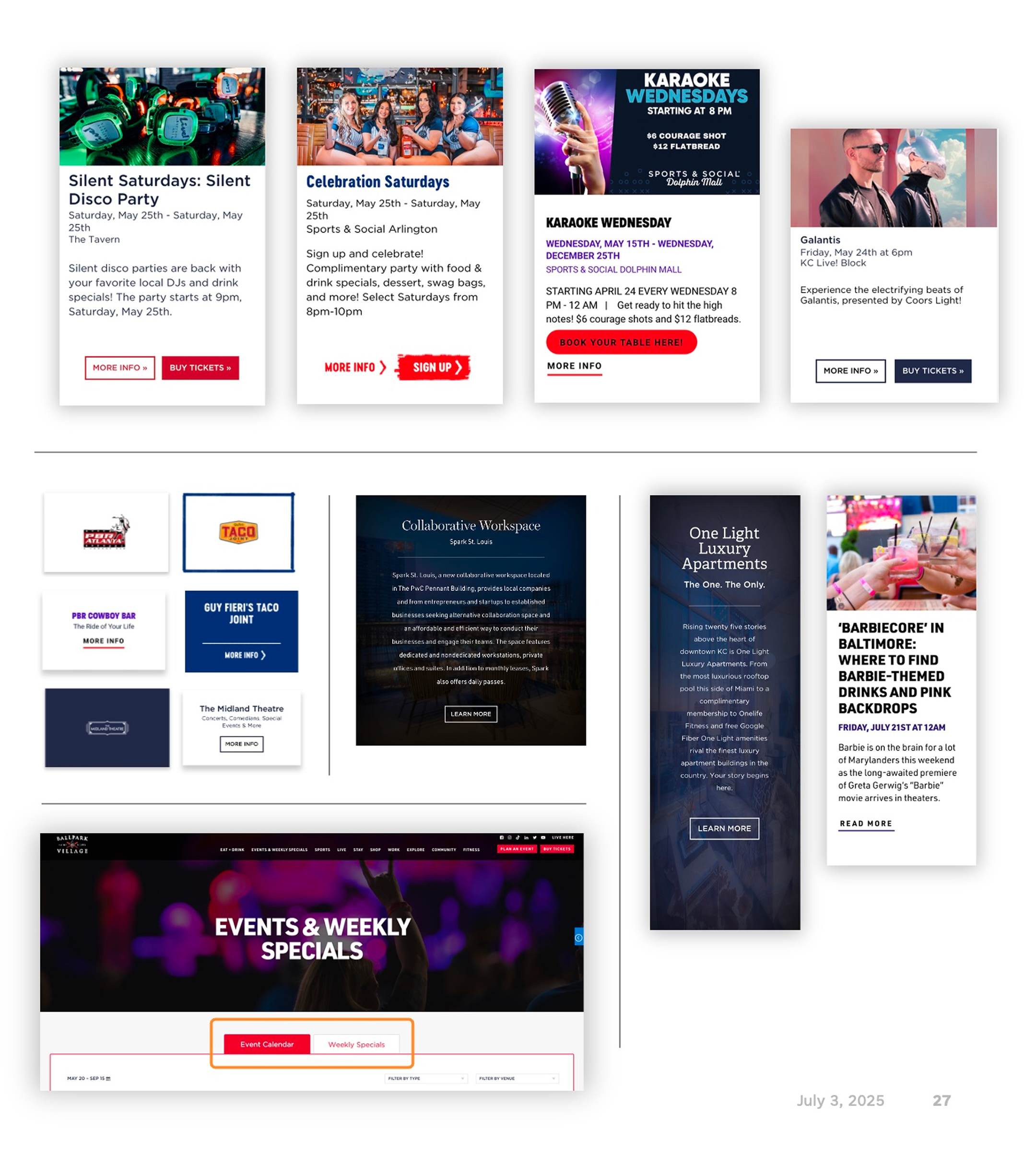
ACROSS ALL 12 DISTRICT SITES
Business goals & UX Strategy
To get a deeper sense on how current users of the site felt about the site, we interviewed six Live! Districts employees—primarily from the marketing team—who had experience managing both the front-end and back-end of the website.
01. Inefficient Backend Experience
Internal users struggle with Sitecore’s backend due to slow publishing times, frequent glitches, and a steep learning curve.
02. Lack of Brand Representation
Stakeholders expressed that the site feels too static. They had a need for dynamic visuals, video, and storytelling to better engage users and reduce drop-off.
03. Limited Content Flexibility
Rigid templates and limited control over event promotion make it difficult to highlight high-impact content or adapt messaging by District.
DESIGN PROCESS
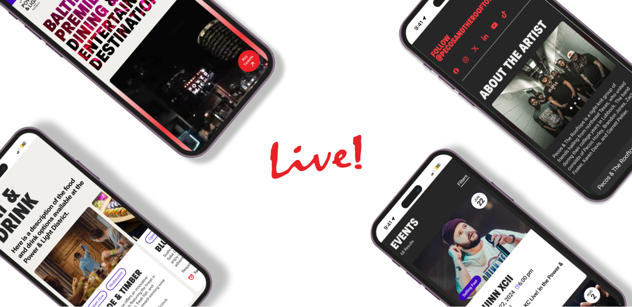
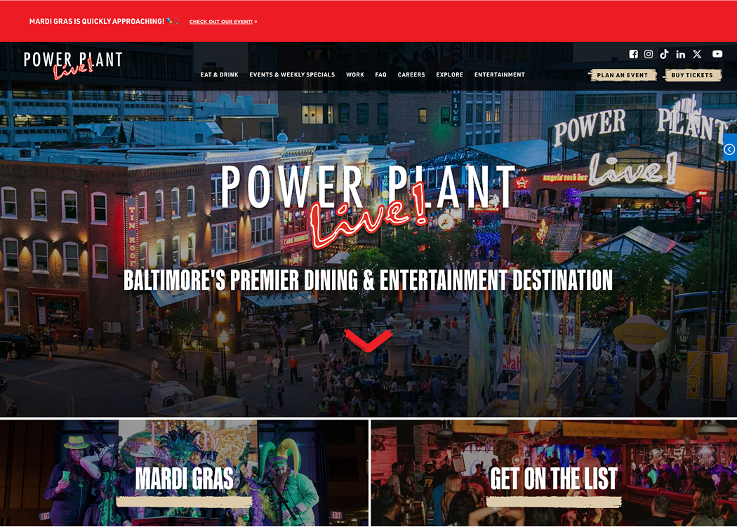
Through our stakeholder interviews, we gained clear insight into the vision for the redesigned site—above all, they wanted it to feel energetic, dynamic, and alive. Motion, bold visuals, and a sense of excitement were consistently emphasized as essential qualities to better reflect the Live! brand experience online.
With those goals in mind, the team began sketching and explored ways to ways to bring energy into the user journey while maintaining clarity and usability.
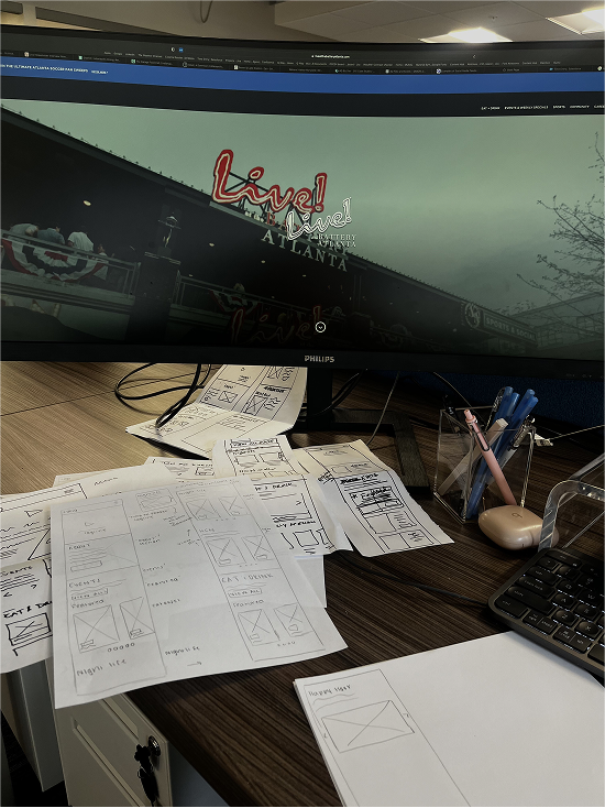
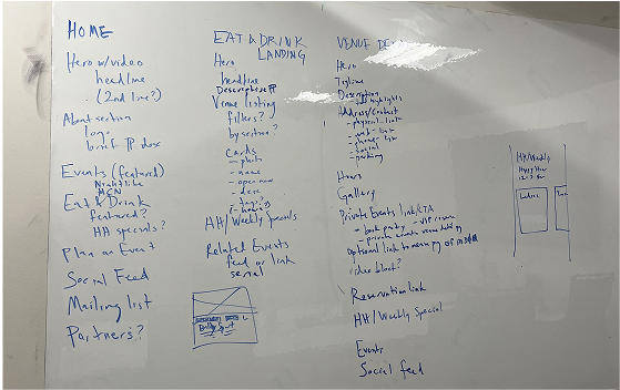
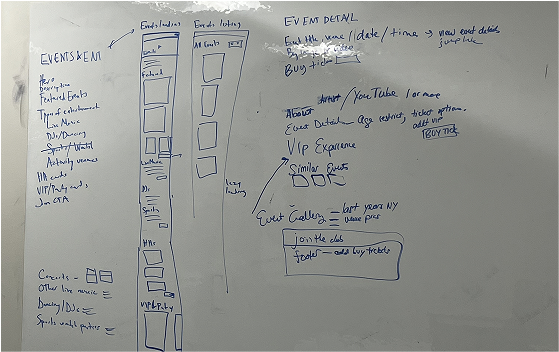
Below are the finalized sketches that began the process of mid-fidelity. It was emphasized to design in mobile first since 95% of their online users accessed the site via phone.
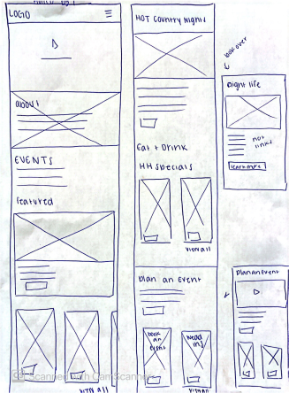
HOMEPAGE
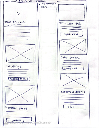
PLAN AN EVENT
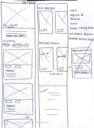
EAT & DRINK
TESTING & ITERATION
During mid-fidelity prototyping, we conducted multiple rounds of iteration with stakeholders to ensure the design reflected both business priorities and user needs.
Key updates driven by feedback:
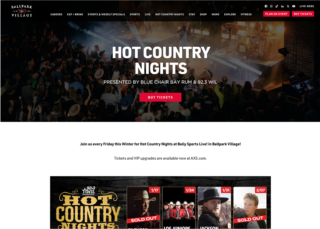
- Featured Events Section: Originally a single event with carousel — restructured to highlight three events side-by-side, giving users more context at a glance.
- Sticky “Buy Tickets” Footer: Added a persistent CTA for quick access to event tickets — improving conversions and meeting a core KPI.
These changes helped balance storytelling with direct user action, without crowding the visual hierarchy.


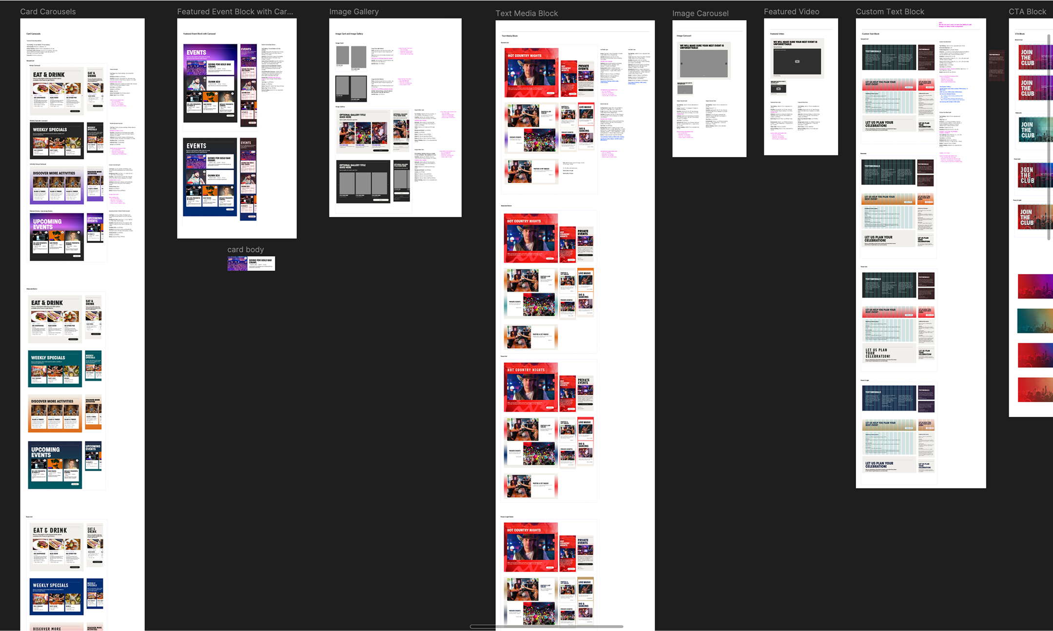
COMPONENT LIBRARY
We successfully created 12 major reusable components that could function across all districts sites. Creating scalable consistent designs while still supporting the unique needs of each location.
KEY TAKEAWAYS
This project was my first official experience working on a UX team in a full-time role—and it was an incredibly rewarding learning curve. I gained a deeper understanding of how to collaborate cross-functionally, communicate design decisions clearly, and advocate for user needs in a fast-paced environment.
One of the biggest lessons was learning how to speak up and share my perspective, even when working alongside more experienced stakeholders. With a tight timeline and high visibility, I had to stay adaptable, prioritize quickly, and trust my process. This experience not only sharpened my UX skills, but also gave me the confidence to contribute meaningfully to the team.
Click here for Live! Link